Sharon has worked in the warehouse for fifteen years. She knows every product code by memory and can spot packaging damage from across the loading bay. She's brilliant at her job. She's also the person who still calls IT when she needs to change her email signature because computers make her nervous.
When her company introduced new inventory software, the training session started with explaining database concepts and system architecture. Sharon stopped listening after five minutes because none of it related to what she actually needed to do, which was scan items and update stock counts. The software worked fine if you understood how it was structured. For Sharon it was a maze of unclear buttons and cryptic error messages.
This happens constantly with business software. Developers build systems that make perfect sense to them. The people who actually need to use those systems every day end up confused and frustrated because the design assumes technical knowledge they don't have and don't need for their jobs.
Starting with what people actually do
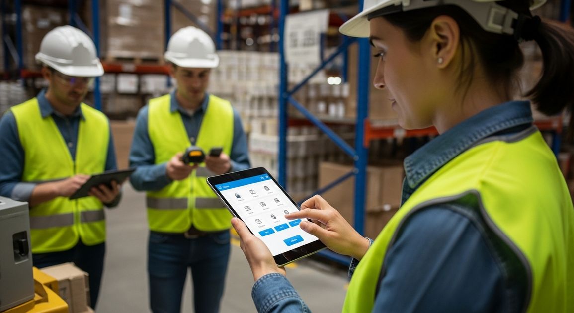
We spent a morning in a warehouse watching how receiving worked. New stock arrives on pallets, someone checks it against the delivery note, Items get scanned and are then moved to storage locations. The whole process takes about twenty minutes per delivery when things go smoothly.
The existing software required scanning the delivery note barcode first, then selecting the supplier from a dropdown list of two hundred names, then entering quantities for each item individually even though the scanner had already captured that information. The warehouse team had developed an entire workaround involving paper checklists because the software flow made no sense for how they actually worked.
We redesigned it to match their natural process. Scan the delivery note and the system pulls up everything it expects to receive. Scan each item as you check it and the quantity updates automatically. Everything you scanned matches what was expected so you confirm and move on. The whole interaction takes three taps and maybe thirty seconds.
Sharon can use this without thinking about it because it follows what she was already doing before any software existed. The technical complexity is still there behind the scenes. She never sees it.
Making errors impossible to make
A facilities management company needed software for logging maintenance jobs. The old system had a field for entering the building name as free text. People typed "Main Office" and "Main office" and "Head Office" and "HQ". The database treated these as four different buildings. Reports were useless because the data was a mess.
The technical solution would be dropdown lists with validated entries. This works fine for developers filling in forms carefully. For maintenance engineers working fast on tablets whilst standing in a plant room, scrolling through a list of sixty building names to find the right one is painful. They'd often pick the wrong building just to get past that field quickly.
We added location services so the app knows which building you're in when you open it. The building name fills in automatically. You can change it if the GPS is wrong. Most of the time you don't need to think about it at all. Errors dropped to almost zero because the system handles the bit that was causing problems.
This principle applies everywhere. If people regularly make the same mistake, the interface design is wrong. You fix the design so the mistake becomes impossible to make.
Showing people what they need when they need it
A healthcare company built software for care home staff to log resident observations. Blood pressure, temperature, medication taken, meals eaten. Lots of information captured multiple times per day by busy carers moving between residents.
The original design had every possible field visible on one long form. The thinking was that having everything in one place meant fewer clicks. For care staff it meant scrolling through twenty fields when they only needed to enter three pieces of information. They'd miss required fields or enter information in wrong places because the form was overwhelming.
We changed it to show relevant fields based on context. Recording medication? You see medication-related fields and nothing else. Recording vital signs? Different fields appear. The system remembers what measurements are usually taken at what times for each resident and suggests those fields. Everything else stays hidden unless you specifically need it.
Care staff suddenly found the software easier to use because each screen showed exactly what they needed for that specific task. The same system handles the same amount of information. For the user it feels simpler because they only see their bit at the right moment.
Using language people recognise
Technical accuracy often makes interfaces harder to understand. A logistics system we worked on had buttons labelled "Initiate Dispatch Protocol" and "Generate Manifest Documentation". The drivers using it thought in terms of "Start Delivery" and "Print Delivery Notes". The technical terms were correct according to industry standards. They meant nothing to the actual users.
We changed every label to match how drivers talked about their work. The functionality stayed identical. Adoption improved immediately because people could find what they needed without translating from formal terminology into their working vocabulary.
This matters more than most developers realise. The user manual might explain that "Generate Manifest Documentation" means print delivery notes. People don't read user manuals. They look at a screen, can't find what they need in five seconds, and decide the software is difficult to use.
Designing for interruption and distraction
Most business software assumes you'll sit down, complete a task, and move on. Real work doesn't happen like this. You start entering an order and the phone rings. You deal with that call, then someone walks up with a question, then you remember you needed to check something else. Twenty minutes later you come back to the half-finished order form.
Software that doesn't handle this reality causes problems. Forms that time out and lose your work. Systems that don't save partial entries. Applications that forget context when you switch away to deal with something else.
We build systems that save everything immediately and remember where you were. Close the tab mid-task and come back tomorrow. The form remembers everything you entered. You can have six partial tasks in progress simultaneously because that's how real work happens when you're being interrupted constantly.
This requires more complex technical architecture because the system needs to track incomplete states and handle conflicts when multiple people work on related tasks. For users it means the software adapts to their working reality instead of forcing them to adapt to technical limitations.
Testing with actual users early
We built a booking system for a training company. The first prototype worked fine when we tested it ourselves. We put it in front of the training coordinators who'd actually use it and watched them get confused within minutes.
The calendar view showed availability by trainer. The coordinators think about availability by course type because different trainers deliver different courses. They were trying to find available slots by scanning across multiple trainer calendars mentally filtering for who could deliver specific courses. The interface we'd built required them to do complex mental gymnastics just to answer a simple question about when they could schedule a course.
We changed the view to show availability by course type with trainer names appearing when you select a time slot. Coordinators could instantly see when any qualified trainer had availability for the course they needed to book. Same underlying data structured completely differently because we'd learned how they actually think about the problem.
This only happened because we watched real users try to use the system before we'd built the whole thing. Discovering this issue after completing development would have meant rebuilding major parts of the interface. Finding it during prototyping meant adjusting the approach before we'd invested much time.
What success actually looks like
Six months after implementing new inventory software, Sharon's warehouse team had reduced stock discrepancies by sixty percent. The manager assumed it was because they'd finally got proper software. Sharon knew it was because the system was simple enough that everyone actually used it properly instead of working around it.
When non-technical users adopt software without resistance and use it correctly without constant support calls, that's successful design. The software helps them do their jobs well without forcing them to become technical experts.
Your staff have better things to do than learn complicated software. They need to serve customers, process orders, maintain equipment, deliver services. Technology should make these core activities easier by handling complexity in the background whilst keeping the user experience straightforward.
That's empathic design. Building software that works the way people naturally work so they can focus on what they're good at instead of fighting with systems that assume technical knowledge they don't have.